Tailwind CSS: Building Reusable Components with Ease
Learn to build reusable components with variable CSS classes using Tailwind CSS. A practical tutorial for Next.js and React projects. Improve your workflow today.

Table of Contents
CAUTION
This article was originally written in German and translated into English. While I’ve done my best to ensure accuracy, feel free to leave a comment or send me an email if you spot any areas for improvement.
Are you tired of writing repetitive CSS classes for every button, card, or modal in your web application? What if you could create reusable, customizable components that adapt to your design needs with minimal effort? In this article, I’ll show you how to leverage the power of Tailwind CSS to build modular components that are easy to maintain and customize. Whether you’re using Next.js, React, or any other framework, these concepts will help you streamline your development process.
Setting Up a Next.js (React) Project with Tailwind CSS
To get started, we’ll set up a Next.js project and integrate Tailwind CSS. Next.js is a popular React framework that simplifies server-side rendering, static site generation, and routing. When combined with Tailwind CSS, it allows you to rapidly prototype and deploy modern web applications.
Here’s an example package.json file for a Next.js project:
{
	"scripts": {
		"dev": "next dev"
	},
	"dependencies": {
		"next": "^13.1.1",
		"react": "^18.2.0",
		"react-dom": "^18.2.0"
	},
	"devDependencies": {
		"autoprefixer": "^10.4.13",
		"postcss": "^8.4.20",
		"prettier-plugin-tailwindcss": "^0.2.1",
		"prettier": "^2.8.1",
		"tailwindcss": "^3.2.4"
	}
}
The src folder contains a pages folder with an \_app.jsx and an index.jsx. Below is a snippet of the index.jsx file:
const IndexPage = () => (
	<div className="m-8">
		<h1 className="mb-6">Hello</h1>
	</div>
);

export default IndexPage;
Let’s say we want to add a button to the page:
const IndexPage = () => (
	<div className="m-8">
		<h1 className="mb-6">Hello</h1>
		<button> This is a button </button>
	</div>
);

export default IndexPage;
Creating a Component
It becomes complex in the HTML part of the Javascript file when using multiple buttons, as CSS classes need to be added to each element to style them. The advantage of React is that components can be reused. Moving the button into a component allows for uniform buttons. To do this, create a new Button.jsx file in a new components folder within the src folder:
const Button = () => {
	return <button>This is a button</button>;
};

export default Button;
This button can then be used in the Index.jsx file.
import Button from "../components/Button";

const IndexPage = () => (
	<div className="m-8">
		<h1 className="mb-6">Hello</h1>
		<Button />
	</div>
);

export default IndexPage;
It doesn’t look good, but the button is there.
Passing Children to the Button
One of the key benefits of React components is their ability to accept children as props. This allows you to dynamically inject content into your components. Let’s modify the Button.jsx file to accept children:
const Button = ({ children }) => {
	return <button>{children}</button>;
};

export default Button;
Now, text can be added to the button in the Index.jsx file:
import Button from "../components/Button";

const IndexPage = () => (
	<div className="m-8">
		<h1 className="mb-6">Hello</h1>
		<Button>A button</Button>
	</div>
);

export default IndexPage;
Styling the Button
To create a button with a different color, we update the Button.jsx file:
const Button = ({ children }) => {
	return <button className="rounded bg-blue-500 px-4 py-2 font-bold text-white hover:bg-blue-700">{children}</button>;
};

export default Button;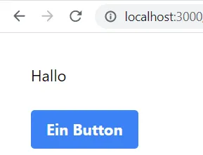
Variants with Tailwind CSS
To create another button with a different color, we modify the Button.jsx file to accept a variant parameter:
const Button = ({ children, variant }) => {
	return (
		<button
			className={`rounded bg-blue-500 px-4 py-2 font-bold text-white hover:bg-blue-700 ${
				variant === "secondary" ? "bg-red-500 hover:bg-red-700" : ""
			}`}>
			{children}
		</button>
	);
};

export default Button;
Then, we can add a variant to the button in Index.jsx:
import Button from '../components/Button'


const IndexPage = () => (
  <div className='m-8'>
    <h1 className='mb-6'>Hello</h1>
    <Button className='mr-4'>A button</button>
    <Button variant='secondary'>A button</button>
  </div>
)


export default IndexPage
Passing Class names
When adding a margin-right to the first button, it has no effect as the Button.jsx file does not receive any class names from the Index.jsx file. o rectify this, we update the Button.jsx file to accept a className:
const Button = ({ children, variant, className }) => {
	return (
		<button
			className={`rounded bg-blue-500 px-4 py-2 font-bold text-white hover:bg-blue-700 ${
				variant === "secondary" ? "bg-red-500 hover:bg-red-700" : ""
			} ${className}`}>
			{children}
		</button>
	);
};

export default Button;
Now, class names can be passed to the button in Ìndex.jsx:
import Button from '../components/Button'


const IndexPage = () => (
  <div className='m-8'>
    <h1 className='mb-6'>Hello</h1>
    <Button className='mr-4'>A button</button>
    <Button variant='secondary'>A button</button>
  </div>
)


export default IndexPage
Passing size
To assign a size to the button, we update the Button.jsx file to accept a size:
const Button = ({ children, variant, className, size }) => {
	return (
		<button
			className={`rounded bg-blue-500 px-4 py-2 font-bold text-white hover:bg-blue-700 ${
				variant === "secondary" ? "bg-red-500 hover:bg-red-700" : ""
			} ${size === "small" ? "px-2 py-1 text-xs" : size === "large" ? "px-6 py-3" : ""} ${className}`}>
			{children}
		</button>
	);
};

export default Button;
Now, a size can be assigned to the button in Index.jsx:
import Button from '../components/Button'


const IndexPage = () => (
  <div className='m-8'>
    <h1 className='mb-6'>Hello</h1>
    <Button className='mr-4'>A button</button>
    <Button variant='secondary' className='mr-4'>
      One button
    </button>
    <Button size='small' className='mr-4'>
      One button
    </button>
    <Button size='large'>One button</Button>
  </div>
)


export default IndexPage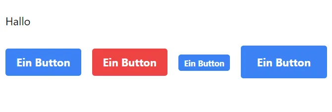
Passing More props
Adding more props to the button can be achieved by updating theButton.jsx file to accept additional props:
const Button = ({ children, variant, className, size, ...props }) => {
	return (
		<button
			{...props}
			className={`rounded bg-blue-500 px-4 py-2 font-bold text-white hover:bg-blue-700 ${
				variant === "secondary" ? "bg-red-500 hover:bg-red-700" : ""
			} ${size === "small" ? "px-2 py-1 text-xs" : size === "large" ? "px-6 py-3" : ""} ${className}`}>
			{children}
		</button>
	);
};
Now, additional props can be passed to the button in Index.jsx:
import Button from '../components/Button'


const IndexPage = () => (
  <div className='m-8'>
    <h1 className='mb-6'>Hello</h1>
    <Button className='mr-4'>A button</button>
    <Button variant='secondary' className='mr-4'>
      One button
    </button>
    <Button className='mr-4' onClick={() => alert('Hello')}>
      One button
    </button>
    <Button variant='secondary' onClick={() => alert('Hello')}>
      One button
    </button>
  </div>
)


export default IndexPage
Now, all other props can be passed to the button.
Optimization
The whole thing could be optimized by outsourcing the classes. You can also use parameters that only have two states directly. To do this, I have to adapt the Button.jsx file:
const Button = ({ children, className, secondary, size, shadow, ...props }) => {
	const classes = [
		"text-white font-bold rounded",
		secondary ? "bg-red-500 hover:bg-red-700" : "bg-blue-500 hover:bg-blue-700 ",
		size === "small" ? "py-1 px-2 text-xs" : size === "large" ? "py-3 px-6" : "py-2 px-4",
		shadow && "shadow-sm hover:shadow",
		className,
	];

	return (
		<button {...props} className={classes.join(" ")}>
			{children}
		</button>
	);
};

export default Button;
Now I have a modular button that I can use in the Index.jsx file:
import Button from '../components/Button'


const IndexPage = () => (
  <div className='m-8'>
    <h1 className='mb-6'>Hello</h1>
    <Button className='mr-4'>A button</button>
    <Button secondary className='mr-4'>
      One button
    </button>
    <Button className='mr-4' onClick={() => alert('Hello')}>
      One button
    </button>
    <button
      secondary
      className='mr-4 bg-indigo-500'
      onClick={() => alert('Hello')}
    >
      A button
    </button>
    <Button secondary shadow>
      One button
    </button>
  </div>
)


export default IndexPage
As your component grows in complexity, managing inline class strings can become cumbersome. To improve readability and maintainability, let’s outsource the class definitions into a separate object:
const classes = {
	base: "text-white font-bold rounded",
	primary: "bg-blue-500 hover:bg-blue-700",
	secondary: "bg-red-500 hover:bg-red-700",
	small: "py-1 px-2 text-xs",
	large: "py-3 px-6",
	default: "py-2 px-4",
	shadow: "shadow-sm hover:shadow",
};

const Button = ({ children, className, secondary, size, shadow, ...props }) => {
	const buttonClasses = [
		classes.base,
		secondary ? classes.secondary : classes.primary,
		size === "small" ? classes.small : size === "large" ? classes.large : classes.default,
		shadow && classes.shadow,
		className,
	];

	return (
		<button {...props} className={buttonClasses.join(" ")}>
			{children}
		</button>
	);
};

export default Button;
Variable Classes
However, when variable classes are needed in a component, additional steps are required. For example, if we have created a new index page with two texts separated by a divider component:
import Divider from '../components/Divider';


const IndexPage = () => {
  return (
    <div>This is the text above the new component</div>
    <Divider />
    <div>This is the text below the new component</div>
  );
};


export default IndexPage;
The divider component with TypeScript looks like this:
const style = {
  base: 'h-0 border-t-2'
}


type DividerProps = {
  className?: string,
  space?: number,
  color?: string
}


const Divider = ({
  className,
  space = 1,
  color = 'transparent'
}: DividerProps) => {
  const classes = [
    style.base,
    `my-${space + 1} md:my-${space}`,
    `border-${color}`,
    className
  ].join(' ')
  return <div className={classes} />
}


export default Divider
I have created a component here that creates a distance between two elements. To do this, I have introduced a space variable that specifies the distance. When using the divider with custom spacing as shown below:
[...]
<divider space={4} />
[...]
The spacing remains unchanges, although I have set it to 4. And the frame is not transparent. PurgeCSS has already purged the classes my-4 and border-transparent. The Tailwind documentation also recommends using the class as a whole in standard cases. Two solutions are proposed to address this issue (of course, you could just use pure CSS or SCSS, but that’s not the point here).
Comments
One solution is to write the classes that should not be purged in a comment area within one of the files. For instance:
const style = {
  base: 'h-0 border-t-2'
}


type DividerProps = {
  className?: string,
  space?: number,
  color?: string
}


const Divider = ({
  className,
  space = 1,
  color = 'transparent'
}: DividerProps) => {
  const classes = [
    style.base,
    `my-${space + 1} md:my-${space}`,
    `border-${color}`,
    className
  ].join(' ')
  return <div className={classes} />
}


export default Divider


// my-1 md:my-1
// my-2 md:my-2
// my-3 md:my-3
// my-4 md:my-4
// my-5 md:my-5
// my-6 md:my-6
// my-7 md:my-7
// my-8 md:my-8
// my-9 md:my-9
// my-10 md:my-10
// my-11 md:my-11
// my-12 md:my-12
// border-transparent
// border-primary
// border-secondary
These classes will no longer be deleted.
Safelist
The other solution involves defining the classes in the tailwind.config.js file using a safelist:
/** @type {import('tailwindcss').Config} */
module.exports = {
	content: ["./src/**/*.{js,ts,jsx,tsx}"],
	theme: {
		extend: {
			colors: {
				primary: "#1e89e7",
			},
		},
	},
	safelist: [
		"border-transparent",
		"border-primary",
		{
			pattern: /my-[0-9]+/,
		},
	],
	plugins: [],
};
The regular expression in the safelist specifies that all classes starting with my- and are followed by one or more digits should not be deleted.
Both are not the most excellent solutions, mainly because you include classes you may never use, but it works.
Conclusion
In this article, I have presented a method for implementing a design system using CSS in Tailwind without resorting to external plugins or unpopular @apply statements used by Tailwind CSS developers. I hope this article has been helpful and look forward to your feedback.
Related Articles
Host Google Fonts Locally in Your Tailwind CSS Project
Self-host Google Fonts locally in your Tailwind CSS project for better performance and GDPR compliance. Step-by-step guide to eliminate external font requests.
Astro.js & Docker: Deploy Your Site on a VPS (Static & Dynamic)
Astro.js with Docker on your VPS: static (Nginx) or dynamic (Node.js). Full tutorial with current Dockerfiles, Docker Compose, and deployment workflow.
Build a Blog with Gatsby.js and Ghost CMS on Your VPS
Step-by-step guide: Build a blog with Gatsby.js and Ghost as a headless CMS. Set up everything on your VPS, configure Docker, and publish your website.